Montessori in Redlands
A Green Acres client for over 10 years, Montessori in Redlands consistently needs design solutions from us that convey their core values to their highly-invested community of educators, parents, and students.
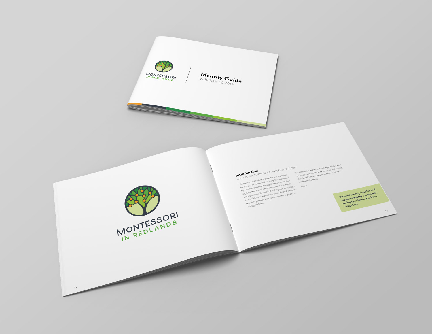
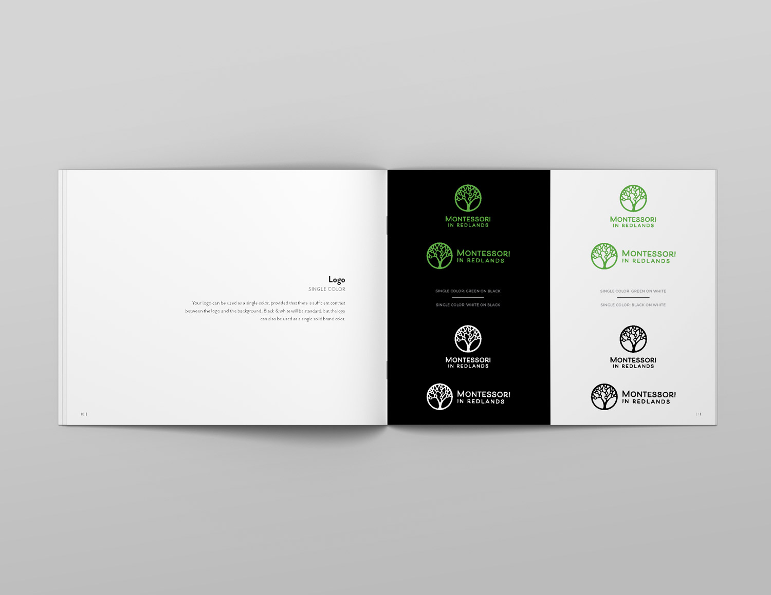
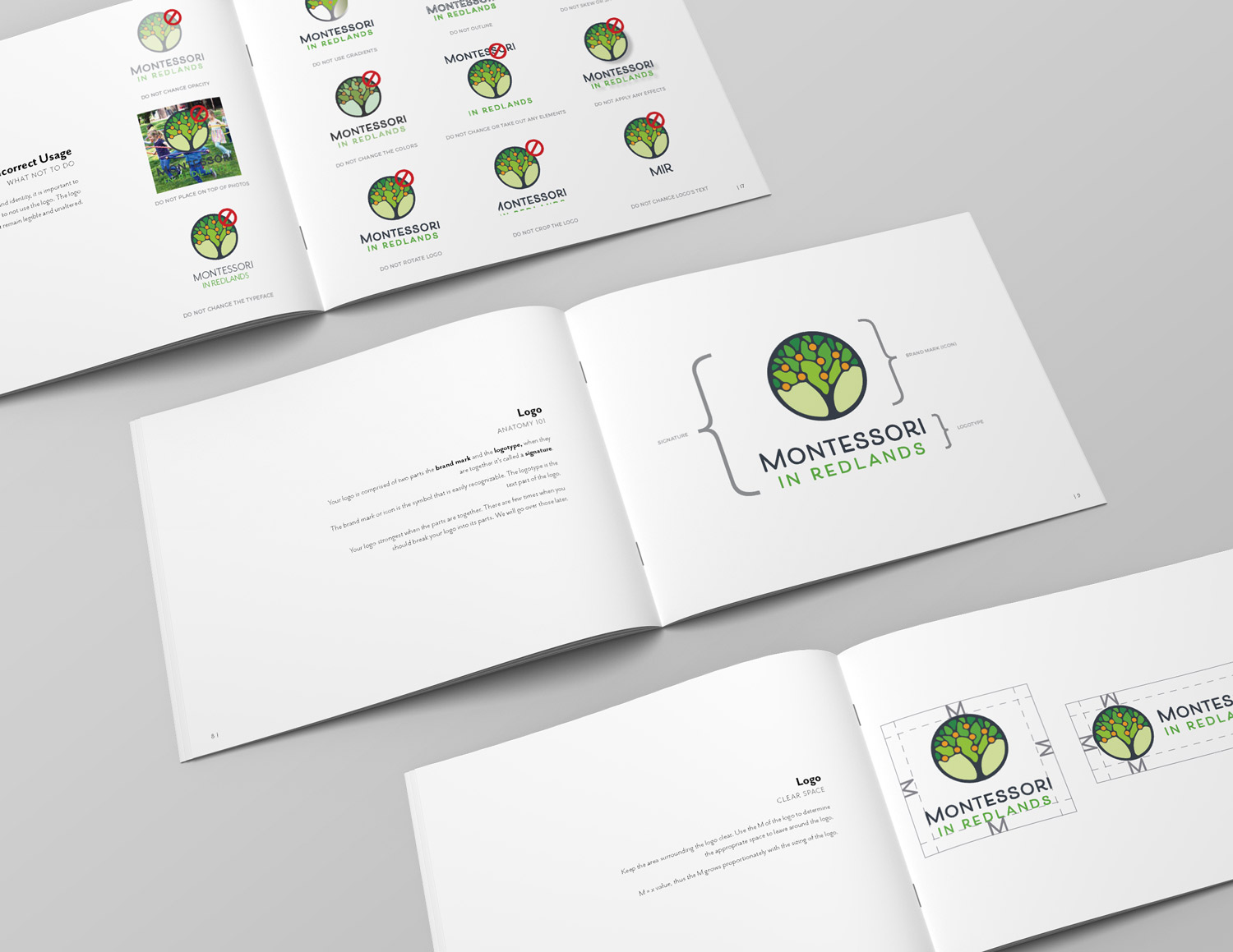
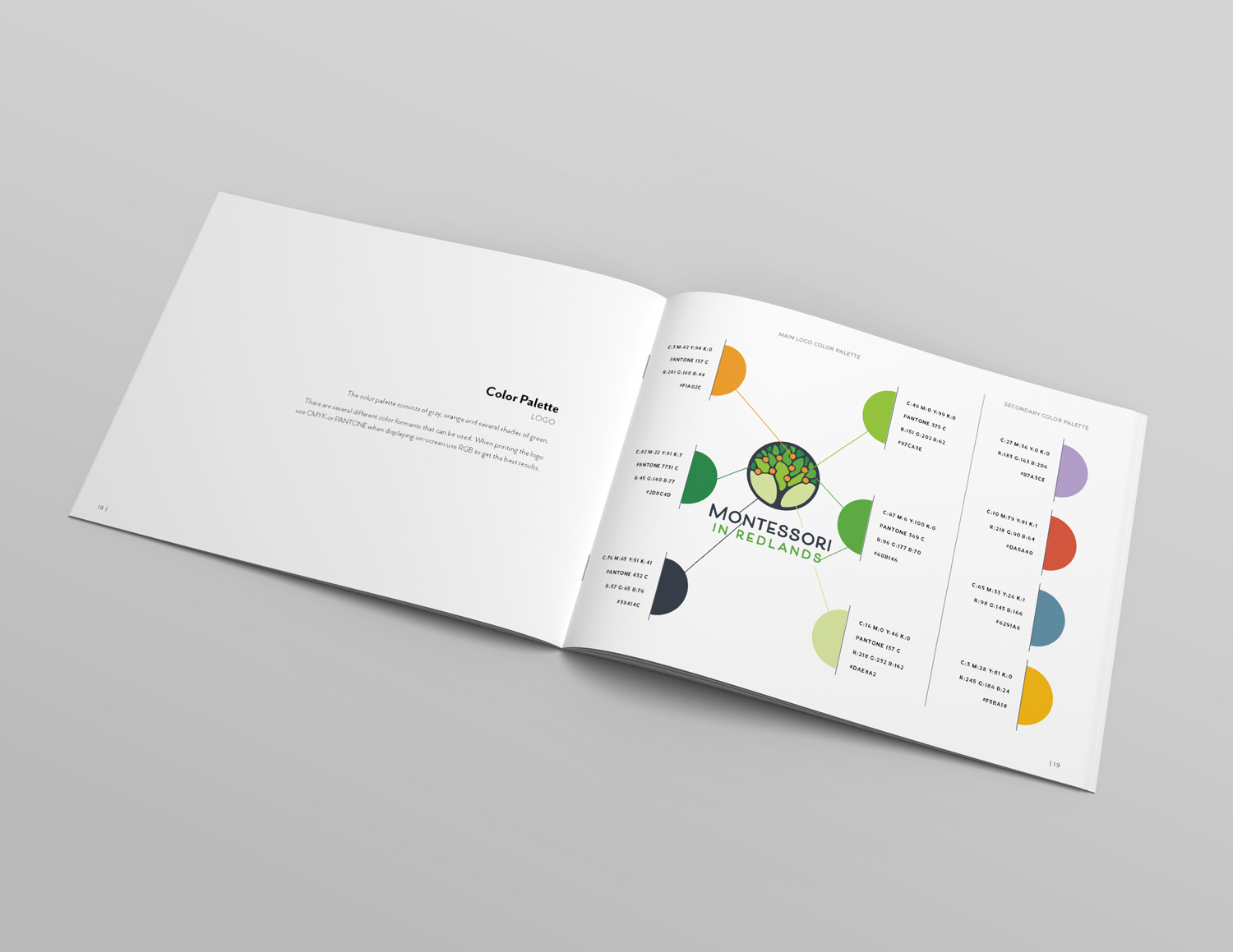
Brand Identity
Montessori in Redlands uses hands-on learning and focuses on crafting the minds of their students to help them become the best version of themselves. In 2019, we updated their brand identity, drawing inspiration from the orange groves in which the school sits, and the Arts and Crafts movement from the 1900s, both of which are key parts of Redlands’ history. The resulting brand mark is detailed yet simple, with a tree that represents physical and intellectual growth, nine oranges to represent a multiplicity of the school’s core values, all encapsulated by a circle that represents MIR’s holistic methods.

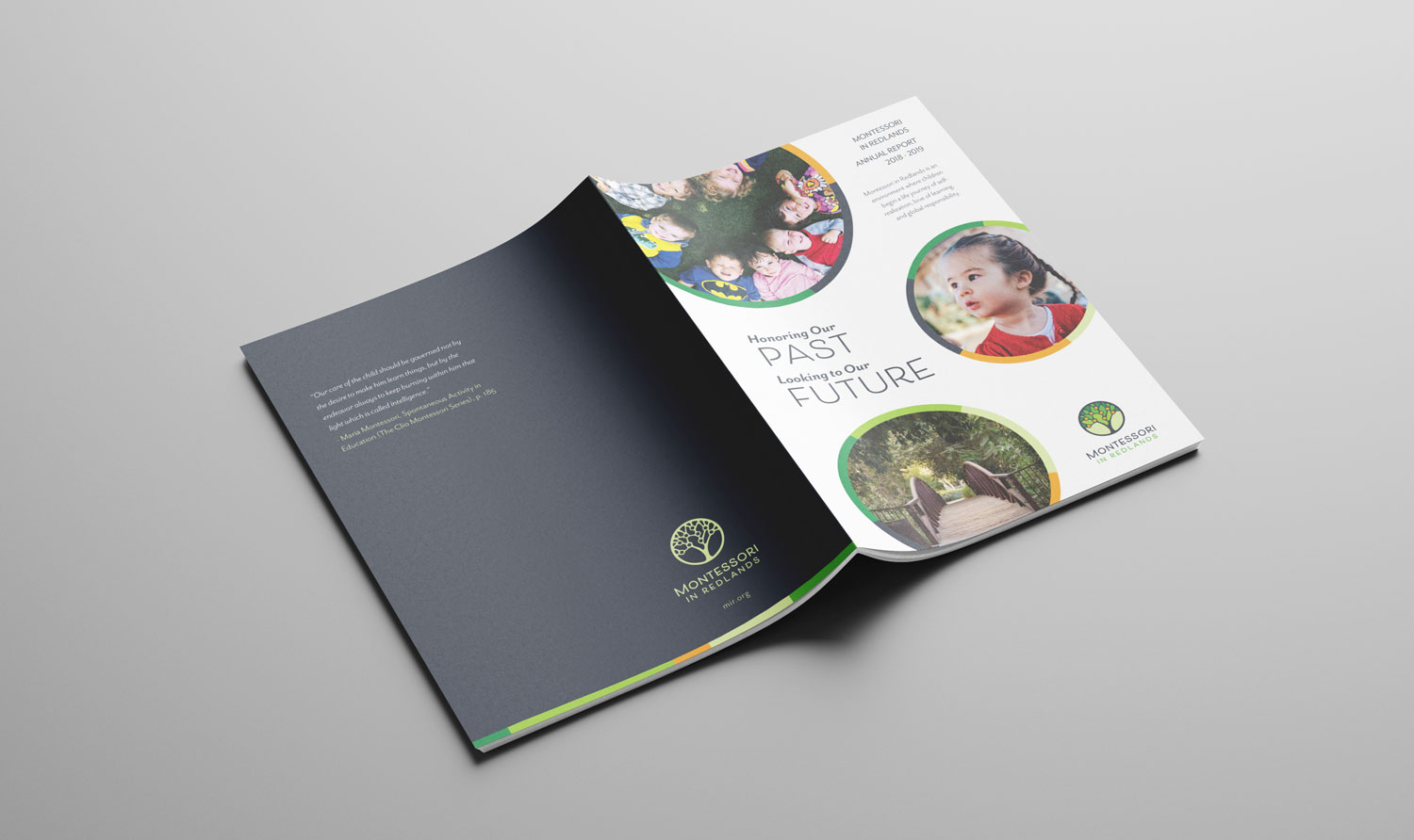
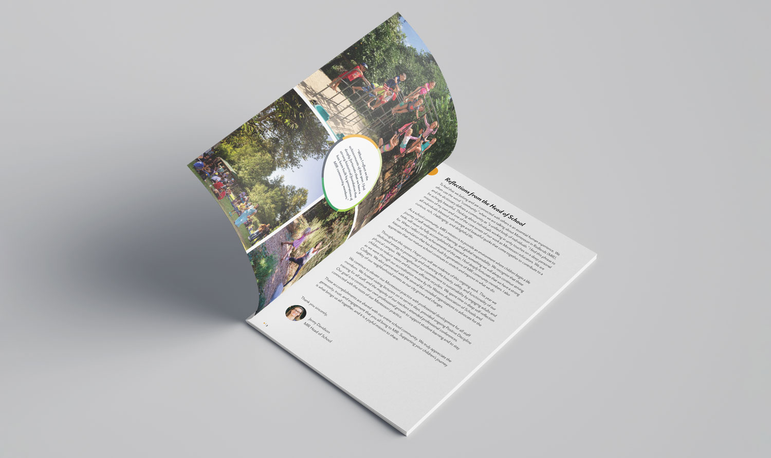
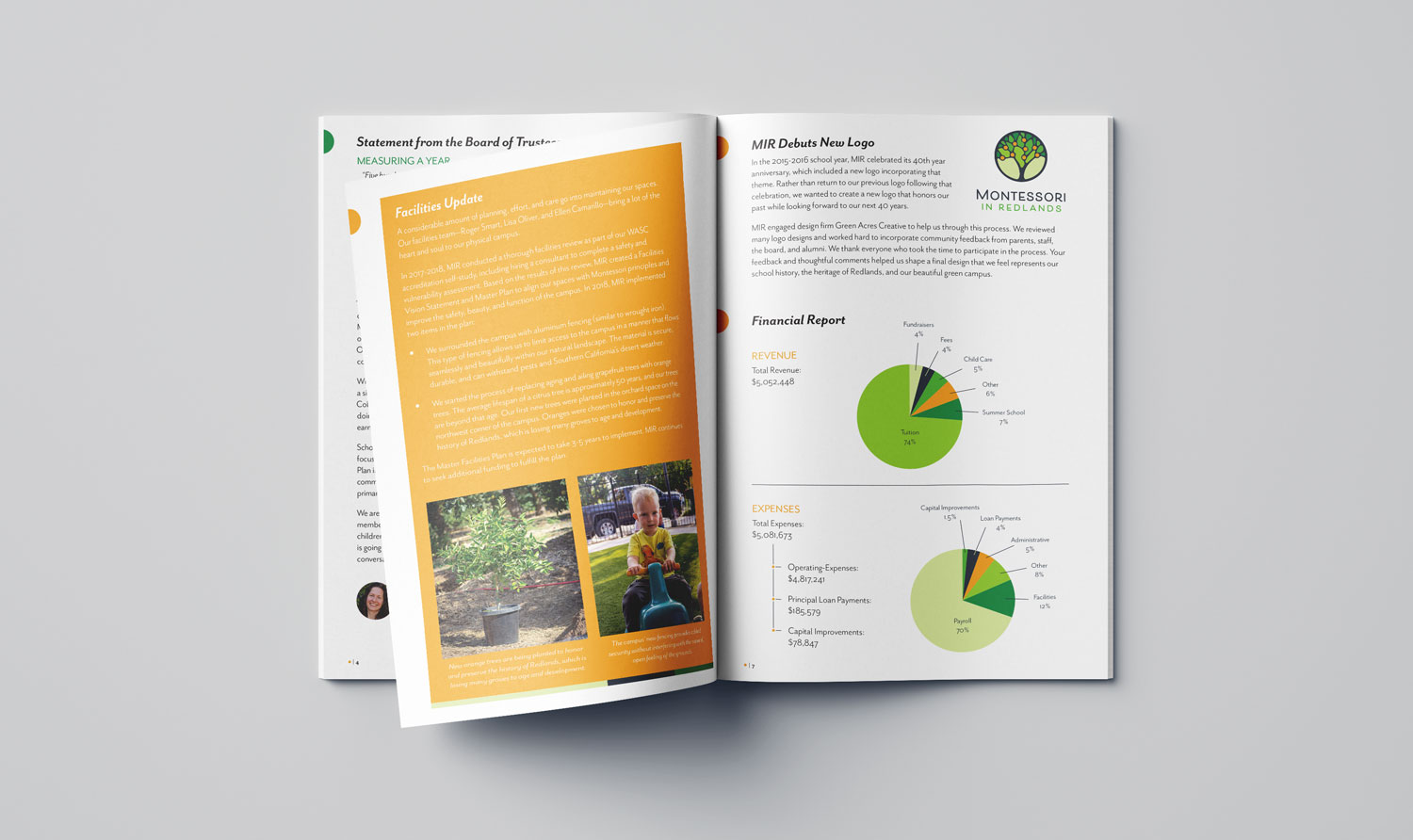
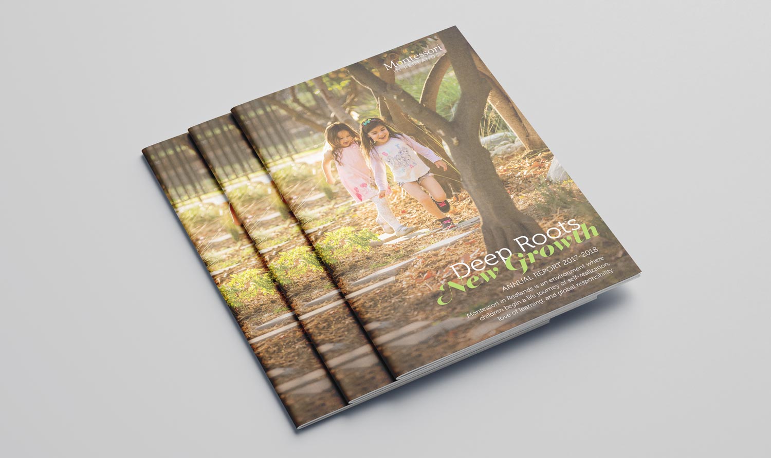
Annual Report
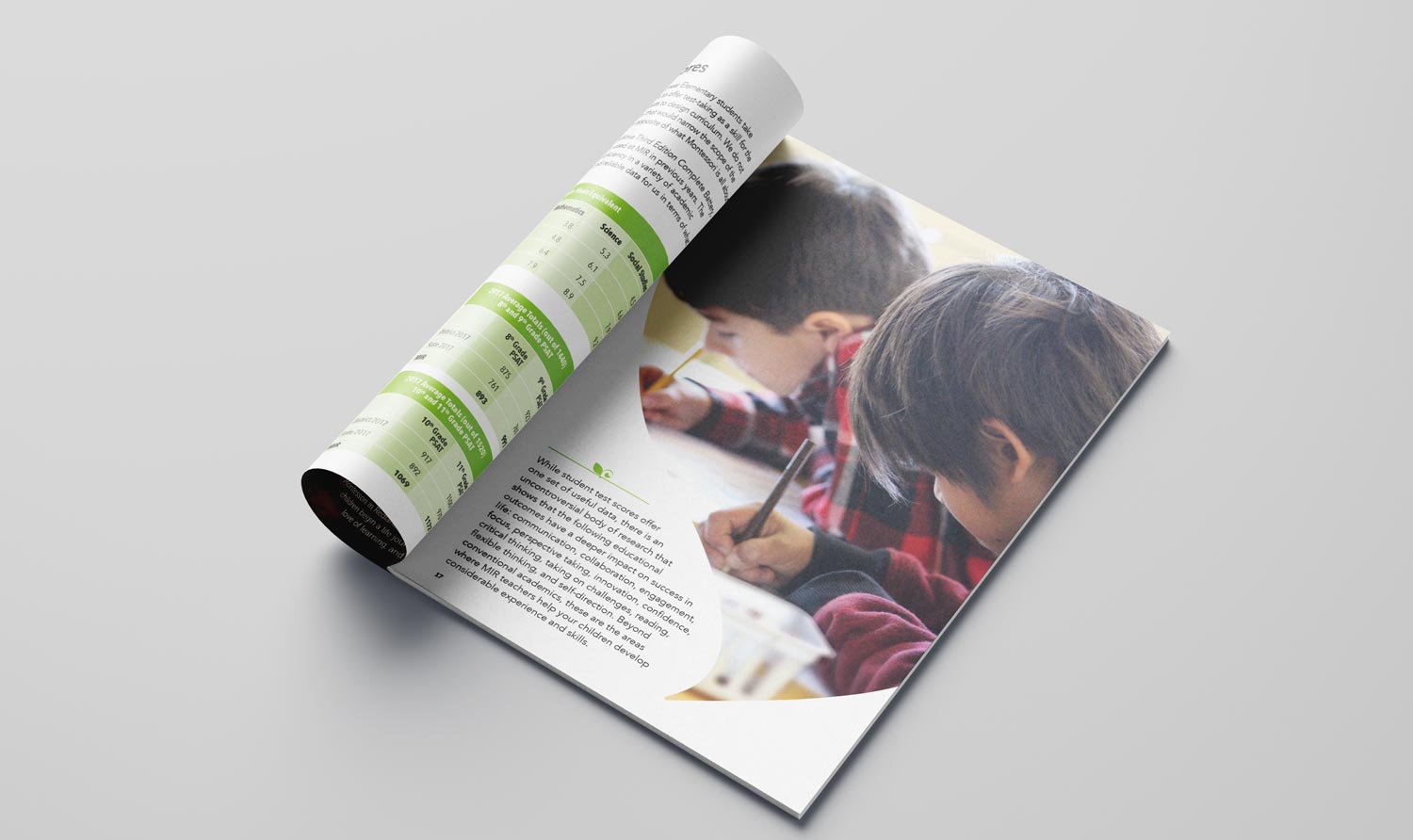
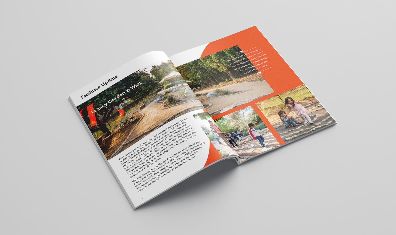
Each year is a new opportunity for us to help share the growth of Montessori in Redlands with their parents community. Designed with custom infographics, all-original photography, and dynamic layouts, MIR’s Annual Reports are an important extension of the school’s brand and credibility with their community.